
I’ve written the material for my book’s cover. What else can I do to create a great cover?
At JewishSelfPublishing, the author is welcome to be involved in all stages of the publishing process. In the last blog post, we discussed the basic elements of a book cover that an author should supply (the title, subtitle, author’s name, blurb, author bio, and review). But what can an author do to help his book stand out from the rest of the pack?
Graphic Elements
A great cover is alive, telling a unique story – the story of your book. The best and most direct way to tell that story is by using powerful imagery.
Think for a moment of a great novel. What stands out about its cover? A captivating image – cryptic, exotic, or dynamic – can beckon the reader to enter into another reality and experience an unforgettable tale.
In a work of nonfiction, the right imagery can serve the same purpose, engaging potential readers before they even turn a page by building credibility, displaying professionalism, or appealing to a reader’s imagination.
A book’s cover can also be used as part of an effort to brand a person or product. If the goal of a book is to promote a business, its logos and brand imagery should appear on the cover as part of the marketing process.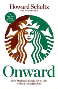
If the purpose of a particular book is to help publicize the author as an expert in a field, then using a photograph of the author looking the part on the cover is a great marketing strategy.
But not every cover has an image. Nonfiction books often utilize strong typography to help them sell. A graphic designer can play with lettering, fonts, and colors in such a creative manner that the cover virtually shouts out to you to pick it up.
Besides the imagery and typography, there is one more element that is crucial in designing a knockout cover: color. Choosing the right colors makes all the
difference in the world! Each color sends a message – happy or sad, modern or classical, entertaining or technical – and the color of the cover should match the tone of the book.
The Hierarchy
The next strategic decision to make is choosing the hierarchy of the different pieces of content on the cover. In other words, which of the elements should be displayed more prominently than the others?
Let’s make a quick study of book covers by analyzing a few books written by late US Senator John McCain.
 The Restless Wave – The hierarchy of this cover is very clear: 1) image, 2) author, and 3) title. What does the image tell me? John McCain was a confident man. And placing a US flag in the background is a subtle way of depicting him as a patriot, which he was. Confidence and patriotism are obviously the thrust of this book. And the hero in the picture is obviously John McCain, in case you didn’t recognize him before. What does the title tell me? Not much. Nor do I notice it much either. It obviously doesn’t matter. It’s a book about John McCain the hero, period.
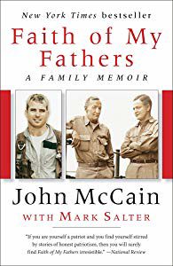 Faith of My Fathers – Here the hierarchy is more even. But there’s still an order to it: 1) title, 2), image, and 3) author. Although two photographs appear front and center on the cover, they don’t give me much information on their own. It is only after I read the title that I appreciate that this is a family memoir, and I therefore deduce that the two pictures are the author and his father and grandfather. The author’s name tells me which family this is about. I wouldn’t give this cover an A+.
 Hard Call – The hierarchy here is clear: 1) image, 2) title, and 3) author. What strikes me the most is the dark background and the ominous figure of Lincoln. This imagery tells me we are dealing with a very serious, heavy book. The second most prominent item is the title, Hard Call, which also sounds very tough, matching the imagery, but doesn’t tell me much about the content of the book. Finally, we have the author’s name, John McCain, who is a famous tough guy. OK, I get the message of the cover, and therefore . . . I’m not buying the book. None of this is going to make me happy. If you notice, the first two covers say “New York Times bestseller,” but this title lacks this claim. I’m not surprised.
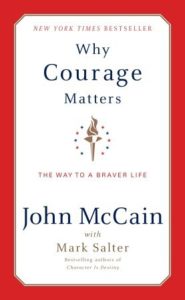 Why Courage Matters – This cover is totally different than the others. There is only one small image in the middle, which basically serves as a divider, and then some plain text with a red border. The hierarchy is different here, because the imagery isn’t as important: 1) title, 2) author, and 3) color. It has a fresh look, which I like. The word Courage is enlarged (a use of strong typography), which emphasizes the content and appeal of the book. Indeed, this is another New York Times bestseller.
The Graphic Designer
Once an author has all of the elements of the cover in hand and an idea of how they’d like the hierarchy to work, the next stage is to hire a good graphic designer who can transform them into an appropriate cover design. I use the word appropriate intentionally, because the ultimate goal is to create a cover that tells the story of your book. In order to do that correctly, the graphic designer should devote some time to reading the manuscript in order to get a feel of the content and flavor of the book. Otherwise, the cover might look great but fail at capturing the essence of that particular book. In order to assist the graphic designer in ascertaining the character of the book, the author, editor, or publisher should convey, orally or in writing, a brief description of what he or she believes are the primary themes of the book that should be displayed on the cover.
That sums up book cover design from an author’s perspective. I hope you found these posts helpful and enjoy taking an active part in creating you own knockout cover.
Leave A Comment